
Contrast is the state of each and every design element in relation to its neighbors. A lot of designers ignore it or simply take it for granted. Most people think of it only as it applies to colors, but contrast applies to all types of design elements. Contrast is important because everything gets its value from its relative elements. Nothing has value by itself, hence, controlling the level of contrast, we can increase or decrease the value of any particular element.
By definition, Contrast (/ˈkɒntrɑːst/) is “The state of being strikingly different from something else in juxtaposition or close association.”
Elements Influenceable by Contrast
Focus
The focus is the most important part of any interface. This is what everything relies upon because all websites have incentives, but the difference is that good incentives get accomplished through managing the users’ focus.
Contrast can be a big help in creating a focus area. At the time of writing, this is DigitalOcean’s (web hosting company) first screen:

The focus area has been achieved by contrasting the white form background with the dark blue header background. Every user is inclined to look at that white panel first, because our brains are inclined to distinguish between things in front of us, in order to make sense of them, and the ones that are more clearly defined, are easier to distinguish. In this case, “more clearly defined” means having a higher level of contrast.
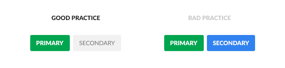
Organisation
A more organized interface is a more clear interface. Each element is but a part of the objective of the interface, and by using contrast creatively, we can control specific choices in order to compel user actions. This is the reasoning behind using colorful primary button colors, as opposed to dim, boring, or even no background at all for secondary buttons. It’s not hard to understand why something that the user is supposed to do needs to stand out.
Types of Contrast
We achieve all kinds of levels of contrast by using opposing elements in relation to each other. We mainly do it through color, but we can do it through other techniques as well.
Color
This is the most used type of contrast and for good reason. We associate colors with all kinds of things, ranging from moods to dietary choices and social hierarchy. Here’s a really good article on Color meaning and symbolism.
Bootstrap, the famous CSS framework, has named its color palette in the following manner: success for green, primary (as in primary action) for blue, danger for red, warning for orange, and information for light blue.
Think about it, it makes sense, doesn’t it? Not necessarily because those colors mean those things, but because we have been using them on the web like that for over two decades now. We’ve all seen errors displayed in red, warnings in orange, and successful messages in green.
Knowing all this, if we ever want to contrast right from wrong, or positive from negative, we can use green and red.
Opacity
We can even use the same color to create contrast. Just use a very light version of it juxtaposed with a darker version.
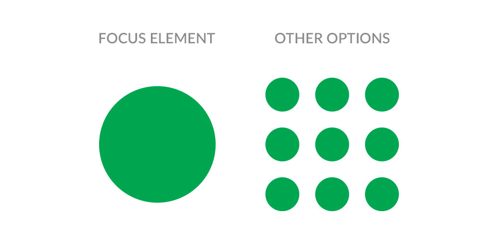
Quantity
Another type of contrast we can achieve is through quantity. For example, on one side we display our focus element, and on the other, we display a bunch of alternatives.
The same applies to text. Most users do not visit sites with the explicit intention to make sense of stuff. They come looking for specific information, meaning that they tend to look for the most basic versions of things, and the easier we make it for them to find it, the better.
Size
Bigger things will always take precedence over small things. This might be due to various reasons, but at least on the web, we’ve constantly educated users to scan for the bigger content first, because that’s how we present titles. The title is almost always at least a little bit bigger than the rest of the content. So, if you have a small number of elements of which you want to differentiate one, simply make it slightly bigger.
The clearest example of this is represented by pricing tables on websites that offer a “best value” option.
Font width
Bold always works if you want to attract attention to a word or a phrase, but use it on all the content and you’ll ruin its effect. That’s why you need to be careful where and how you use it.
Conclusion
I hope that you can see now how important and powerful contrast is, and maybe you’ll pay more attention to it next time you design something.
If you have examples of your work where you’ve used contrast in a smart way, please share them through the comments section below.