
You’ve probably seen by now applications and websites that use content placeholders before the actual content loads. These are simple mockups of the content that’s going to be displayed. Implementing this technique lets a user know what to expect, it makes your page appear more ‘reliable’ because it removes sizing glitches that happen when the content doesn’t load instantly, and, also, it replaces the boring loading screens. Some people refer to this as “Skeleton CSS.”
Why Should We Care?
This practice will take up some design and development time, so, naturally, most of us would ask ourselves if this is really important. Sure, it looks cool and the user might be a little bit happier, but is it really necessary?
Well, we need to understand first that the Internet is a different place today than it was in the early 2000’s. We’ve come a long way from the first pages of the Internet. People aren’t as grateful for entering a website, they’re simply not as willing to wait for your content to load as they once were. Simply because there are sites out there that might load faster. So, whatever we can do to decrease load time, or at least make the waiting process a little bit friendlier, we should definitely do.
How Others Do It
Let’s see how this looks first before we create one ourselves.
Slack
Slack is probably the best example for this because they’ve been doing it for quite a while now.
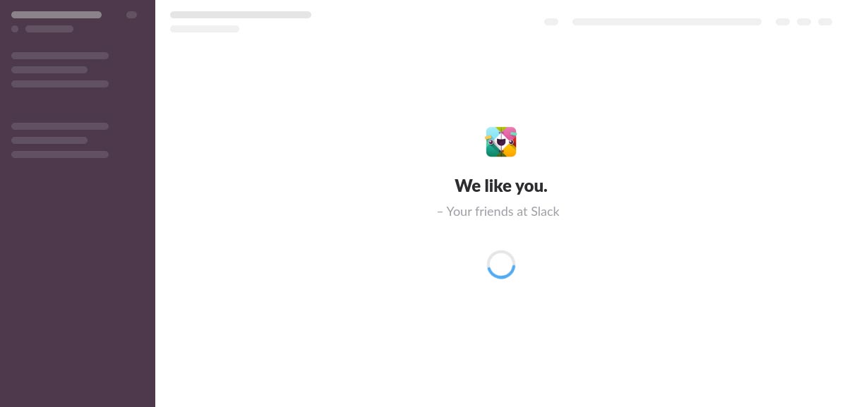
As we can see, they simply mock the actual content with blocks of empty divs. Styled appropriately to match the style of the texts that they hold the place of. There’s nothing much to this design, but you can tell that it’s better than an empty loading screen that doesn’t display anything.
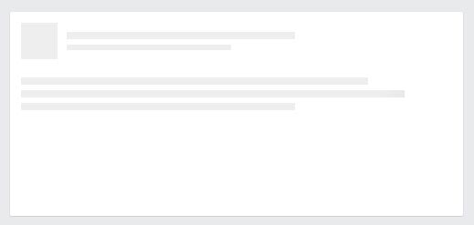
This is what Facebook uses for its posts. They render the initial content via the server side, but when they load more posts to create the infinite scrolling effect, they use that design to showcase new posts.
How To Do It
Now that we’ve got an idea of what this is, let’s see what options do we have to achieve the effect.
SVGs
One way to achieve this would be to use SVG images. They look great in any pixel density and they can be embedded into the page to be loaded first. However, they’re not so great with responsive design. If you’re going to need a placeholder, this option will not work so great.
HTML & CSS
This is the second option and probably your best bet that everything would load fast enough and work well with responsive design.
At the beginning of the article, I mentioned that this would take up some design and dev time. That’s because you’ll need to write additional components to act like the content that’s going to eventually populate the area. Obviously, it’s not going to take a lot of time, but if you want to do it well, it can add up.
Ideas for What to Mock
You can mock anything like text, images, buttons, links, but the main idea is to mock the important information and the elements that take up the most space.
Try not to overdo it. If you have blocks of content that feature large paragraphs, don’t draw 10+ lines to represent the entire content. The idea of a content placeholder is to represent the actual content, not to replace it. You don’t need the placeholder to be as convincing as the content.
Try not to mock text with other text. Don’t use Lorem Ipsum or similar text to represent the actual content. That will create confusion.
When mocking fixed size elements, try to match the sizes of the placeholder with the actual elements.
Use simple shapes like circles and rectangles instead of icons or symbols. Don’t replace content icons with placeholding icons. That falls in the same category as the text placeholders.
Match the colors of the placeholders with the colors of the elements. This doesn’t work for text, but it does for the other elements, like images or buttons. For text, the easiest thing to do is match the color, but reduce the opacity to 10% or 20%.
Use CSS animations. By now users have learned to associate animations with loading states, so if you manage to add animations to your placeholders, do it!
Demo Mock
Let’s see how we may go about creating a content placeholder for a page that also features responsive design.
I’ve created this simple example to disect.
We have a .box class that is applied to the real element with the actual content, and a .box-placeholder class applied to the placeholder.
The lines that hold the place of the text have a simple fading animation applied to them to indicate that something is happening. Remember, people are used to animation to represent loading states. Use them whenever you can. Also, try to use CSS animations instead of JS animations, as they tend to be faster, especially on the mobile.
Notice that the image is represented by a solid color inside a 16 by 9 responsive div. We don’t have to go crazy to represent an image. Not even Google does that on its Google Images site. They use solid colors too.
3 Replies to “Content Placeholders: A Way to Style Waiting Time”
A very useful article, thanks 🙂
When they are animated and all over the page where it flashes after every page load that visually annoys me no different to an animated GIF image in a loop.decades ago and I notice some of them actually seem to slow down the page load.
“People aren’t as grateful for entering a website” I am not grateful, in fact it puts me off when the page is littered full of animatied/skeletons placeholders that flashes on and off slows until the elements like the ones you Youtube.
“they’re simply not as willing to wait for your content to load as they once were.”
I am very patient and I know nothing is perfect but I am not willing to put up with the above (which is not essential to the functionaility of the website and what i see as a decoration and nuisance as with anything animated.)
What I don’t want to see is the above or a an animated loading spinner going around and around and around even if the page hangs that tells me nothing useful of the real loading progress (many years ago I have seen a real one that spun only once and had a percentage and was apparently linked to the page load for a genuining slow website but then most websites I see now take seconds to load and without that UI annoyance hidden it seems quicker.
If it was slow to load initally, say 10 seconds then maybe but not something that takes seconds where it becomes repetitive.
Fair enough. Like with every trend in web design I’ve noticed get introduced over the years, the initial implementations are all over the place and most of the time, too much. Usually, a lot of people have to adapt them and some really talented designers need to use them in more professional ways to inspire others to use those concepts in a way that doesn’t end up bothering the end user more than helping.
I remember this being the case specifically for border-radius and box-shadow. In the beginning there was uneven border radius on every single element, because web devs were excited that we can do that directly in CSS instead of using images to create rounded corners. It took a while for people to start caring about how it actually looks. Same thing for box shadow, in the beginning everybody used huge shadows everywhere and it looked horrible, but most of the time the initial excitement of what’s possible is just too much to notice the actual problems that that simple effect might introduce in usability.
This is again the case for something called “glass morphism”. It’s been introduced in the past couple of years as a concept and if you follow design communities, you’ll see the effect used very randomly and on every single element. Then comes along Apple and introduces it in their operating systems, and it looks beautiful and it doesn’t bother the user in any way.
That being said, and after reading your comment on content placeholders, I believe you’re right, there is such a thing as too much animation for this concept, and I can see how it can easily become annoying, even thought that’s what it was trying to solve.
However, I believe there is middle ground here. I don’t think it will be valuable to get rid of placeholders altogether. I really believe their purpose is valid and it solves a real problem, and I think we can refine them and reduce the animations or remove them altogether. Bu the way, I’ve seen some places where they’ve stopped using animations altogether. They just show empty boxes, and it wasn’t bad at all.
Now, I can also understand that you’d be more willing to wait on even a blank page, but you need to take into consideration things like Google’s constant push for improving the page speed and the Cumulative Layout Shift (CLS) score (this basically measures the shifting of elements on a page before finishing loading, it’s exactly what content placeholders are trying to fix). If you’ve wondered on a website and started reading their content and suddenly an ad or something else loaded and got displayed just above it and the content you were reading got moved down, that’s an example of a bad CLS score and possibly now you can understand how that might be more annoying than just displaying an empty box where the ad would be, so the content that you’re trying to read would not get moved around.
Regardless, very valuable comment, thank you!